
It seems much like its Spanish cousin, with a similar attitude towards site search, breaking familiar ecommerce trends and presenting the user with something against their expectations.
Just to quickly remind ourselves, Zara operates a search tool where the content of the page completely disappears, then is replaced with dynamically loading search results as the user types.
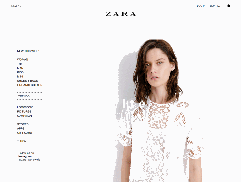
The problem with this is in the unpleasant blankness that occurs before you begin typing as if something has gone wrong with the site. There is also a lack of filters or sorting tools and the full amount of search results is inaccessible from the default view.
It’s also impossible to close the search box, instead you have to navigate away by opening a separate menu. The nil results page is also just a blank page with little in the way of help.
I do however appreciate the originality of the tool, with results being served as large images with hoverable product info, and the automatic suggestions work very well.
Colbenson, the developers of Empathy Broker, which provides the tech behind both Zara and Pull & Bear’s search tools, revealed some interesting insight in their comments on the Zara article.
Chief customer officer Borja Santaolalla explains the logic behind Zara’s idiosyncratic approach to search.
The search experience at Zara has been designed from a discovery perspective. That is, selling clothes is not a functional search, such as browsing a catalogue of electronics, search in fashion is about inspiration, it’s about emotions and empathy.
Search as an inspiration tool, not necessarily as a discovery tool. This approach differs from what we would normally think of as best practice for ecommerce site search.
However, there may be an argument to suggest that this type of search is beneficial to ecommerce sites where there is a single brand on offer, making it more immersive and enjoyable rather than constantly filtering through the multiple brands you’ve become accustomed to.
Angel Maldonado, the CEO at Colbenson, claims that people rarely use filters in single brand fashion.
Less than 2% in our experience. From this small group 80% filter by gender (when there is gender) and nearly 20% colour/pattern/composition.
Whether you agree with this or not, onsite search is an interesting area of development, and any attempt to improve or innovate is to be applauded. It also seems that this ‘inspirational search’ tool is becoming more widely used.
Which finally brings us to Pull & Bear and its search tool, which has a similar philosophy and function to Zara’s, but with many simple improvements.
Instead of completely wiping the page of content when you click in the search box, a smaller flyover appears.

This is definitely an improvement as it doesn’t look like something’s gone wrong with the site.
There is also the very simple addition of a close button, which is definitely lacking from Zara, and a way to toggle between how many results are served on the page.
Thus retaining practical usability whilst also keeping with the minimalist design.

The other important factor is that all the possible results are served in the flyover, not just a curated selection. These continue to load as you scroll down.
There is still a lack of filters though, with options available only surrounding design rather than price or colour.

This goes back to the developer’s research that for single brand retailers extra filters are redundant.
The other improvement is in the nil results pages. Here I am served with alternative products based on my search results.

And at least when I’m served absolutely no results, I can close the search box and navigate elsewhere.

So this is all very interesting. Again I’m not thoroughly satisfied that it completely works, but it’s an incremental improvement on other similar search tools. Please let me know what you think in the comments.
Comments